

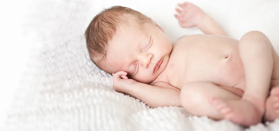
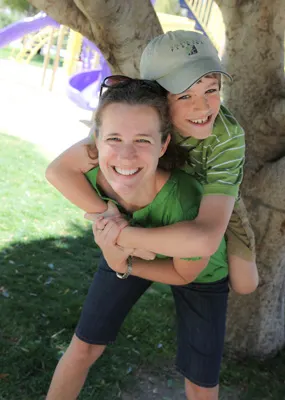
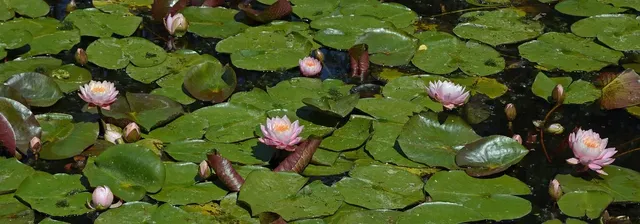
Okey dokey, I've been playing around again (it's what I do when I am avoiding something, you know) and I changed up the blog banner again….do you remember the other one?
Skinnier….little different logo thingy…can't decide which I like better so I say you people who have to look at it should vote! Perhaps there should even be a prize for participating?? Let's say that Friday one of my little minions will pick a random number and the winning commenter will get a $5 Starbucks card in the mail…unless you are someone I see regularly and then your next treaty is on me!
(This is how indecisive I am…just looking at the old one in this post makes me think I might like it better….but that's only because I can't see the new one right now! HELP!!)
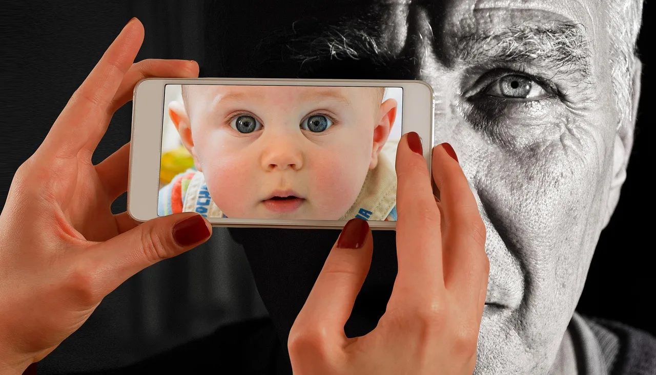





Ok, so the new layout accentuates the circle theme throughout, which I like. But, it takes up a bit more space, so the actual blog doesn’t start till about halfway down the page. So, I’m not much help because I’m torn. Plus, I don’t know if my vote counts, because I normally read in Google’s reader program, and not on the actual page.
Hi.


I like the original…the skinny straight one…
Hope we get to see you soon.
Becky
I’m always good for an opinion but when coffee is involved I am definitely in!
I like today’s version better. Somehow it seems more substantial.
I’ll take my usual…
I like the original one, including liking that logo
Hmm, I like that the photos are bigger in the new one, but I like the linear-ness of the old one. I think you should stick with the old one.
I think they are both fabulous as is the majority of your work but if I had to choose, and if my name was picked for a FREE coffee, I would say the one that has them all lined up in a row. Tell Annie that Emily wants her mommy to win
I like the old one b/c it’s smaller and takes up less of the page — I think it works really well as a blog header. However, I like the new one as a main splash page or a printed postcard/insert b/c I like the layout. But I might switch the Santa baby with the towel picture so that the bright/dark colors aren’t so concentrated on the left side.
Gosh, I’m opinionated. I’ll stop now.
I kind of like the new one. I really noticed the pictures more on it. But then I also wondered if I was in the right place. But the bigger pictures are easier to see well.
I like the old linear one! Hope all is well with you!!
Christina (And Agnish and Luca)
I like the old one because the new one – though VERY cute – takes up too much space. Your recent post of the girls is adorable. They are lovely, photogenic little ladies.
Am I late? The kids aren’t home yet! I like them both but I’m really partial to the squishy baby with the red back ground. OMG!